Branding | SBU
I refreshed the existing visual identity for Stony Brook University, consolidating its logo treatments, typography, and color palette into a more cohesive and consistent brand system. The goal was to strengthen the existing identity while creating clearer standards for how it could be applied across a wide range of communications.
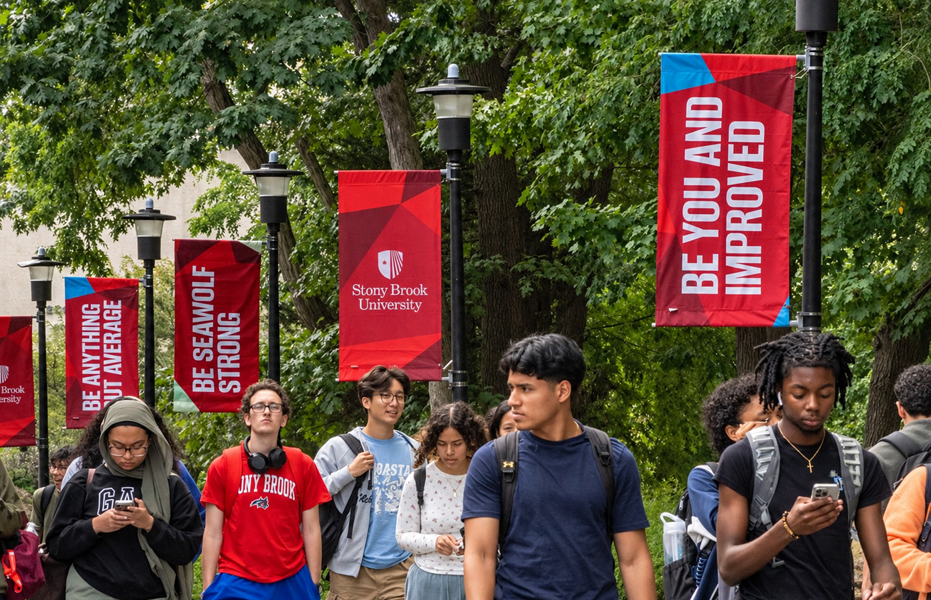
As part of this initiative, a new system of graphic elements was needed. Inspired by prisms and vibrant red gemstones, I developed a flexible visual language that could shift and adapt across different applications while remaining distinctly recognizable as part of the Stony Brook brand.

Logo
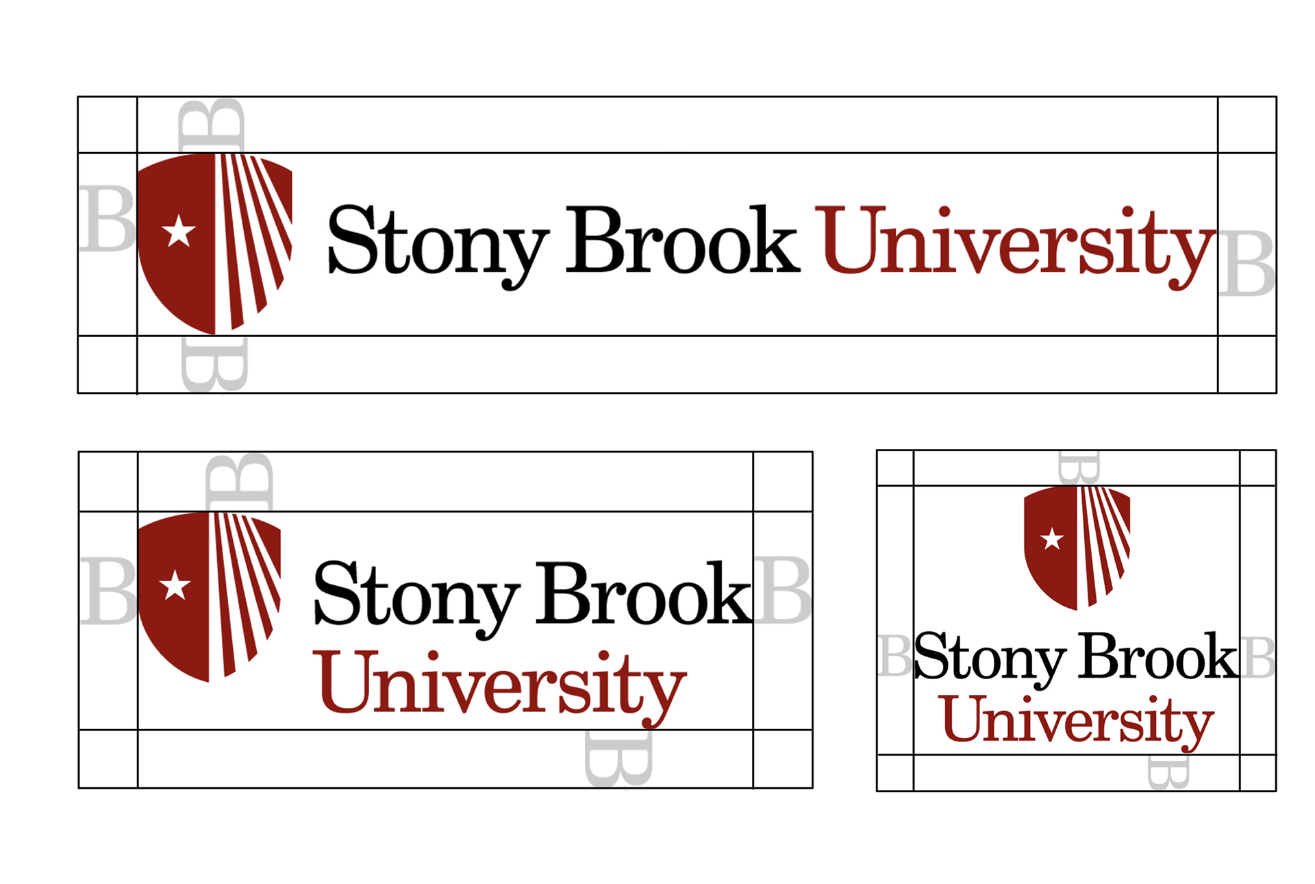
I refined the logo system by remapping clear-space and margin rules using the “B” in Stony Brook as a consistent unit of measurement. I also consolidated the stacked, vertical, and horizontal logo formats, creating a simpler, more cohesive system across applications.

Typography
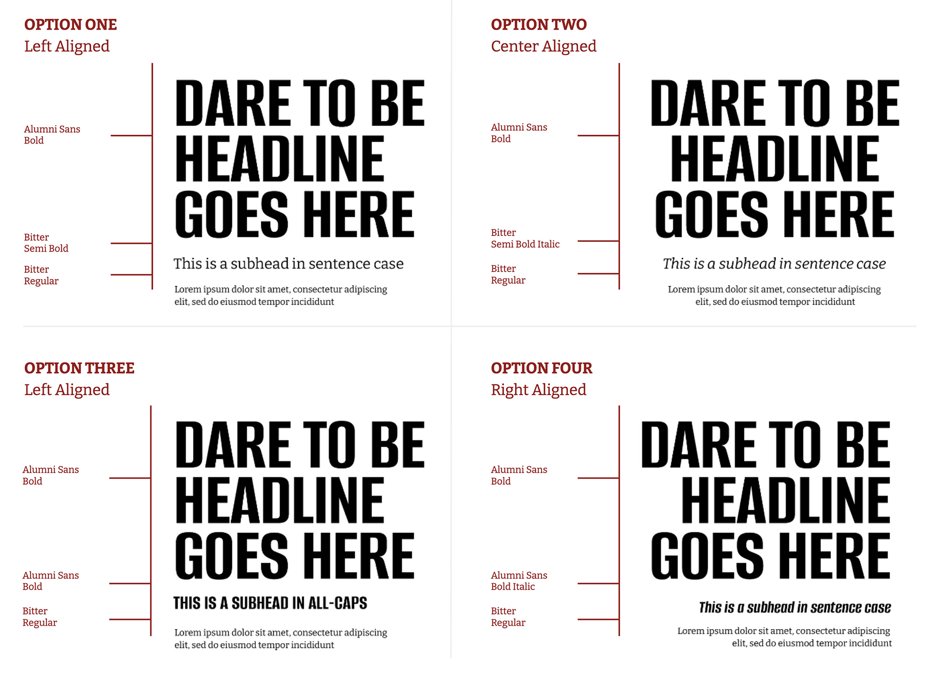
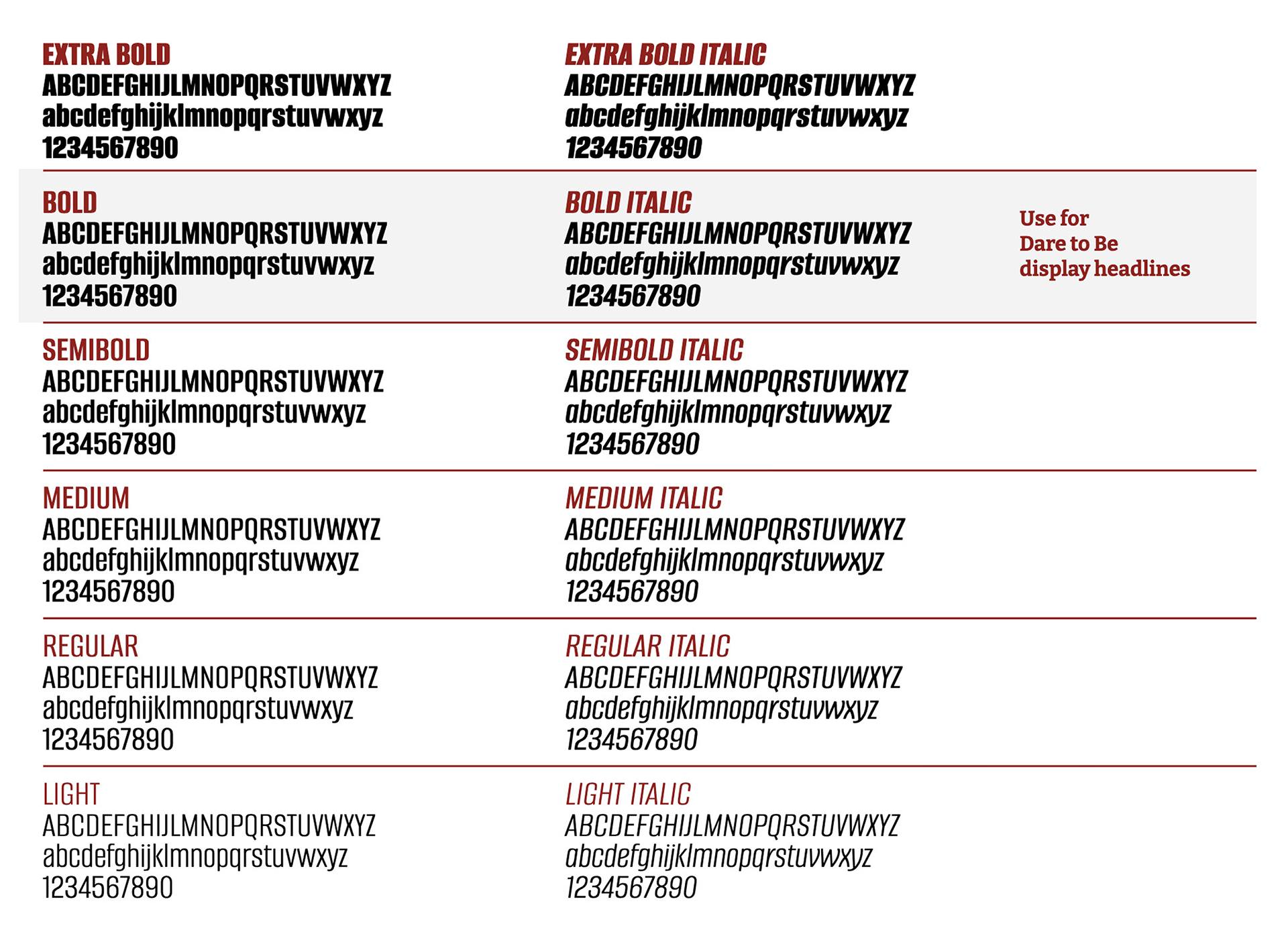
I streamlined Stony Brook’s typography to create a more focused, contemporary system. After exploring a range of typefaces, Alumni Sans was selected as the primary headline font, paired with Bitter as a secondary typeface to add contrast, warmth, and flexibility across the brand.
Colors
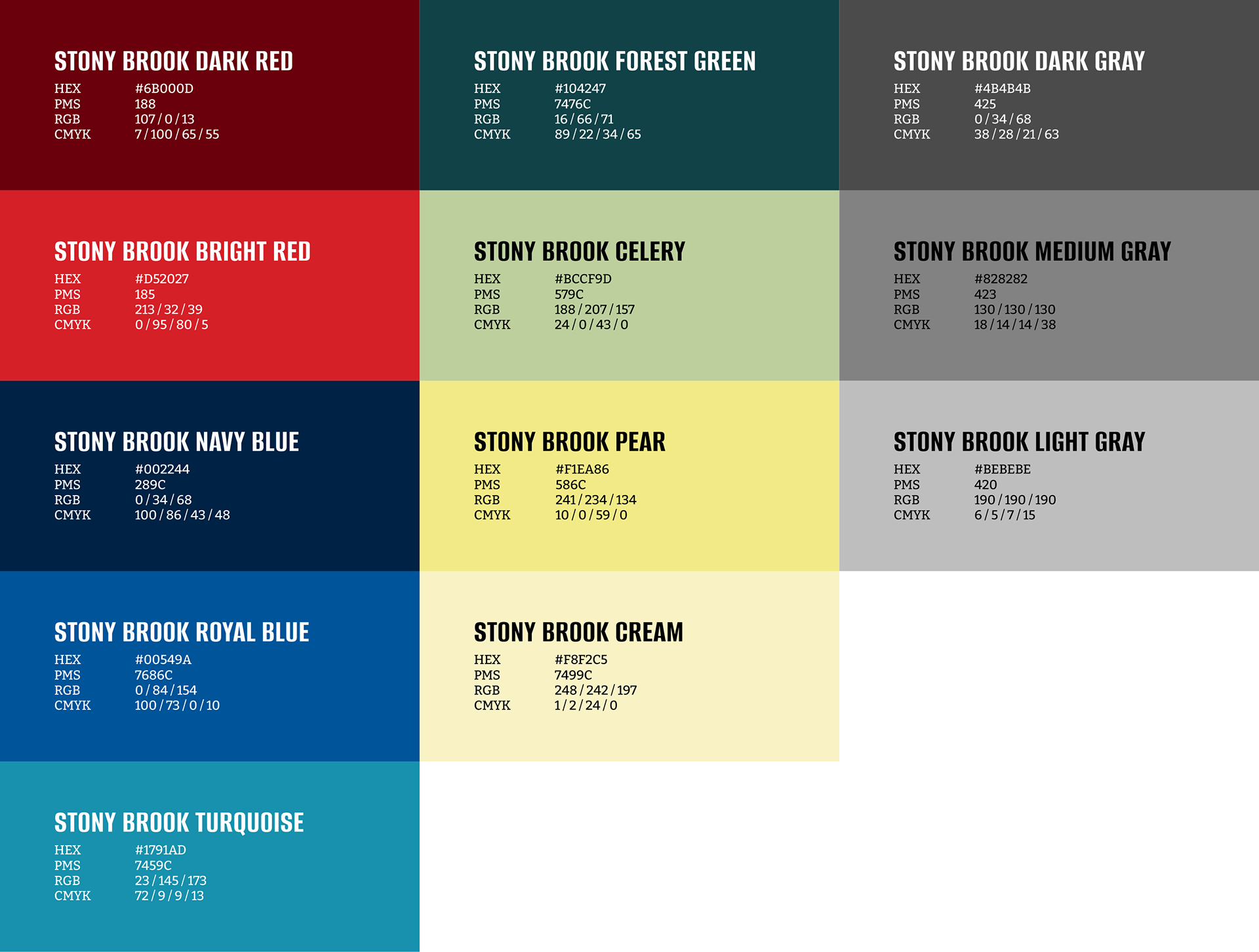
I streamlined and refreshed Stony Brook’s color palette, reducing an extensive range of colors while preserving the established primary palette. Because many secondary colors were already deeply integrated across individual schools and departments, the system was carefully consolidated to balance greater brand consistency with the flexibility needed across the university.

Graphic Element
Inspired by the way prisms and gemstones reflect and refract light, I developed a flexible graphic element that brings depth and energy to Stony Brook’s visual identity. Angular forms shift across the brand’s red palette, creating a dynamic system that can adapt across applications while remaining distinctly Stony Brook.
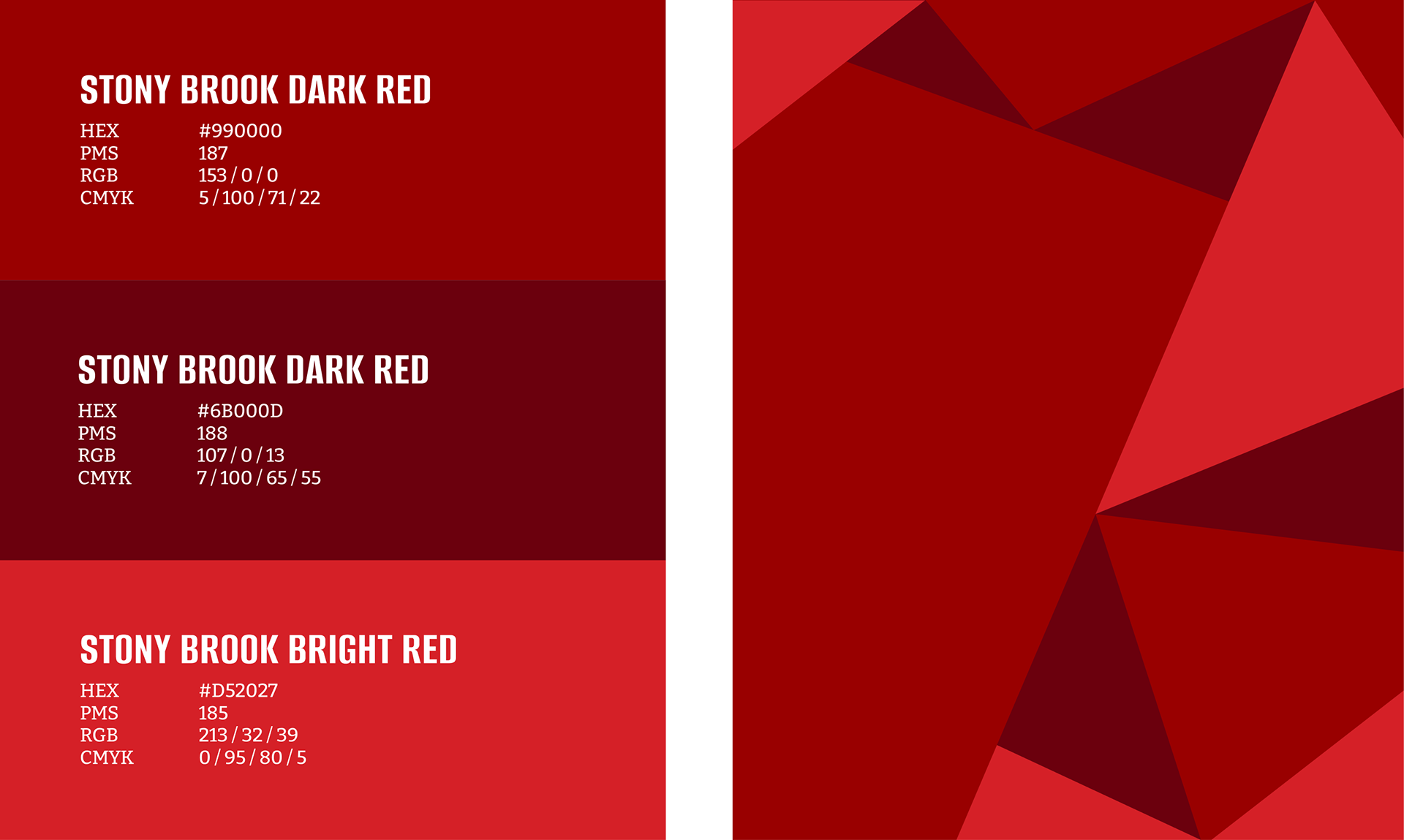

Modular Prism System
A modular set of prism patterns was developed, allowing the elements to be combined, rearranged, and scaled to create a wide variety of compositions.

Prism Construct Examples

Alterations & Framing Device
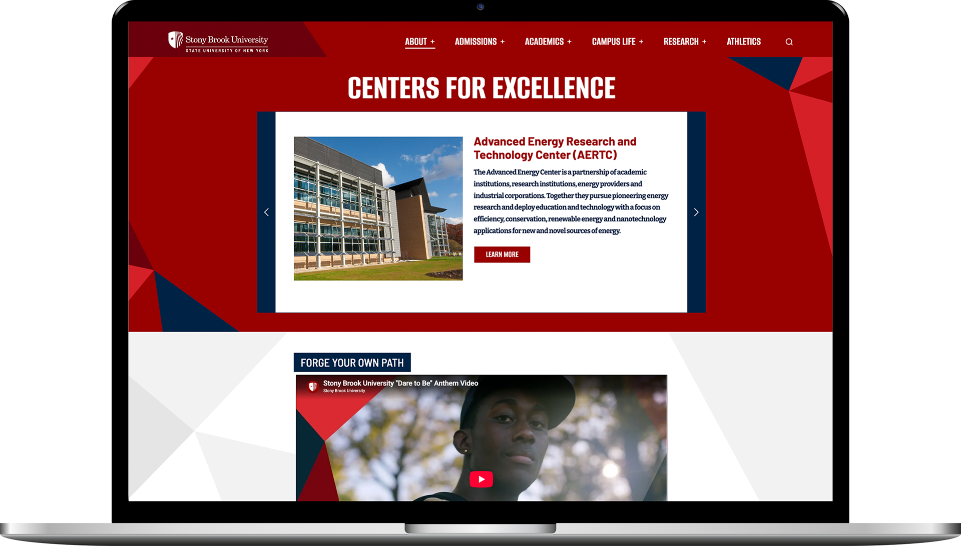
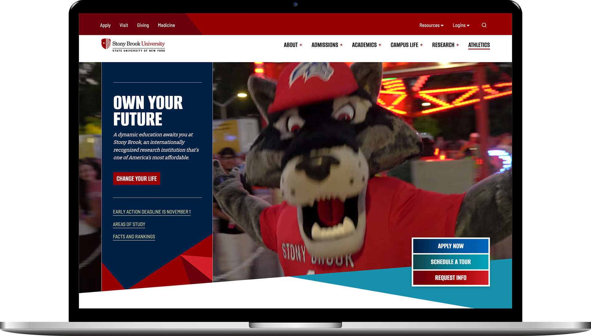
For added flexibility, the system can incorporate a single secondary brand color to create contrast and variation while maintaining a cohesive look. The prism forms can also be used to frame photography, integrating imagery directly into the graphic system and creating a stronger connection between brand and content.

Digital Examples
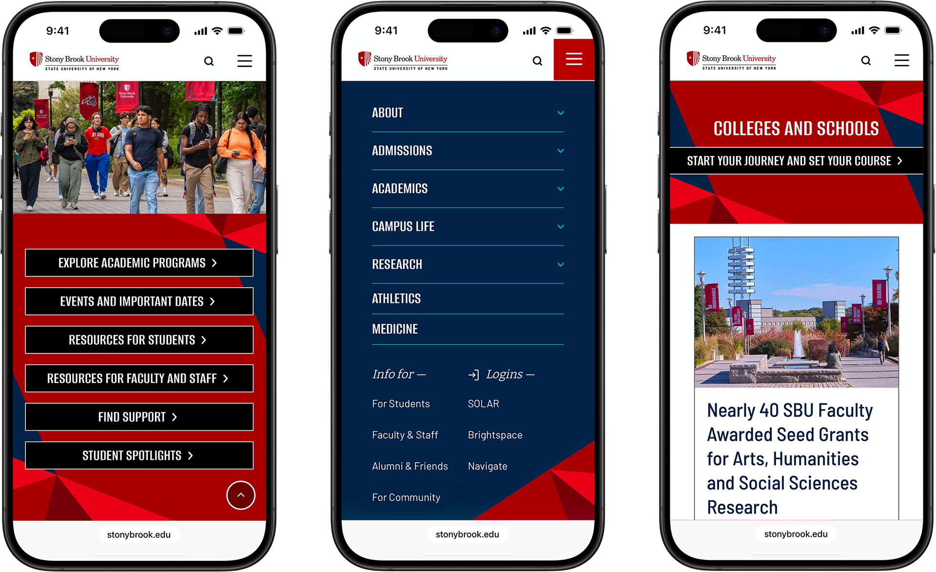
Real World Examples


Credits
Client: Stony Brook University
Agency: Known
Creative Director: Aya Baeshean
Senior Designer: Steve Spavento